( AXA · Jan → Dec 2021 )
Rescuing a tele-consultation MVP.
(01) Context
AXA had just launched an MVP of its medical tele-consultation service, built in a rush. Its rigid “blocks” layout couldn’t handle the variety of services or the product vision.
Objectives
- 01Audit and fully redesign the homepage and dashboard
- 02Convince the client to move away from the original layout
- 03Restructure the pages into a complete end-to-end experience
- 04Base every decision on ongoing user research
(02) The approach
200 users, listened to all year.
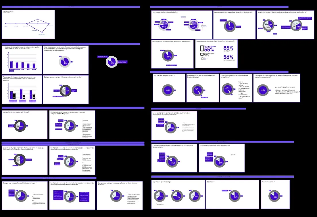
We sent surveys to registered users and analysed them throughout the project. Their feedback turned into design decisions, and gave the client solid arguments.
- 200 Registered users surveyed
- 80% Of usage: FAQ & editorial content
- 6 Focus workshops
- 12 Months of sprints
(03) In pictures
How I worked
(04) My role & process
- 01
Qualitative surveys
Collecting feedback and summarising it into findings and figures.
- 02
Product audit
User feedback, Bastien & Scapin criteria, accessibility and layout, all documented in Notion.
- 03
Focus workshops
Cookies, accessibility, FAQ, booking funnel, dashboard and live chat.
- 04
Service design
Workshops to help the client put its product vision into words.
- 05
Design system in pair design
High-fidelity wireframes and the design system, made with the UI designer.
- 06
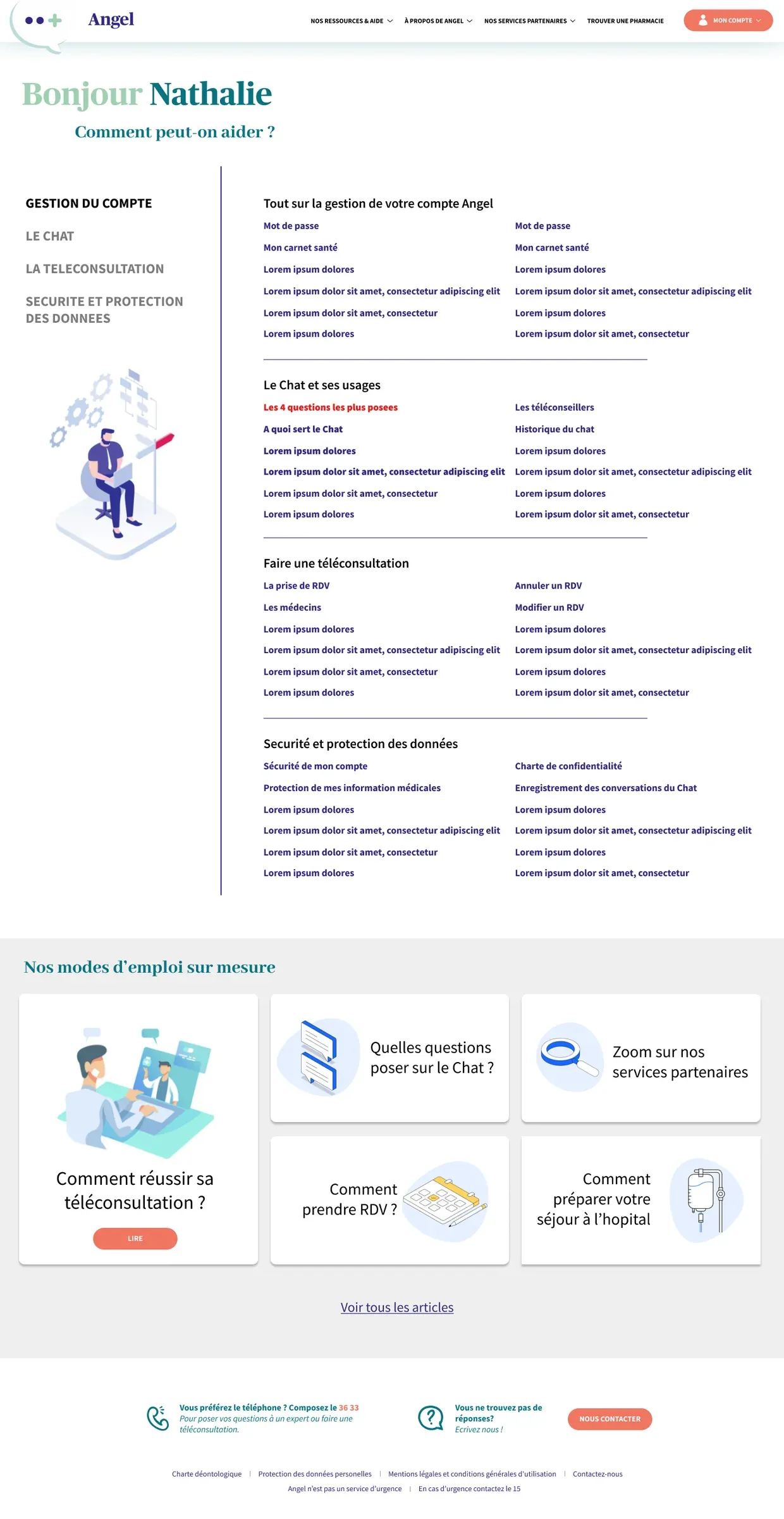
Content & information architecture
Structure and copy, written together with a copywriter.
(05) Close-ups
Everything in one place
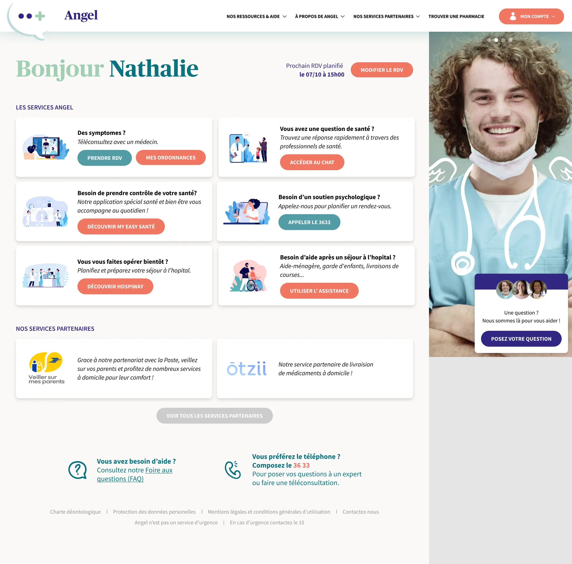
A central dashboard with every available service, upcoming appointments and health articles.
Booking an appointment
A complex flow built around a specific API, designed as a wireflow after working closely with the tech team.
(06) Key learnings
- 01
Ongoing user research
We kept talking to users in every sprint, not just at the start.
- 02
Data-driven design
Survey results settled debates and built the client’s trust.
- 03
Making the case
Solid functional research is what convinced AXA to change direction.